
M&S Energy
Brand strategy, Brand identity, Advertising, Brand guidelines
Operating in a very competitive market, M&S Energy needed to stand out from the crowd. This new identity gave it a unique look within the utilities sector.
The energy sector is awash with brands that show happy, smiling faces in warm living rooms and that use icons and technical drawings to explain their offer. All a bit dull and boring. M&S Energy wanted an identity that would break the mould and be distinctive but also have a premium feel aligned to the main M&S brand.
The M&S Energy logo builds upon the brand plaque from the ‘masterbrand’ but adds a twist - it’s a living, glowing badge running through the heart of the home. Hence the mark does this on the photography quite literally. This energy offer had several unique selling points, including 100% British sourcing, 100% sustainability and, perhaps most importantly, trust of customers so familiar with the parent brand.

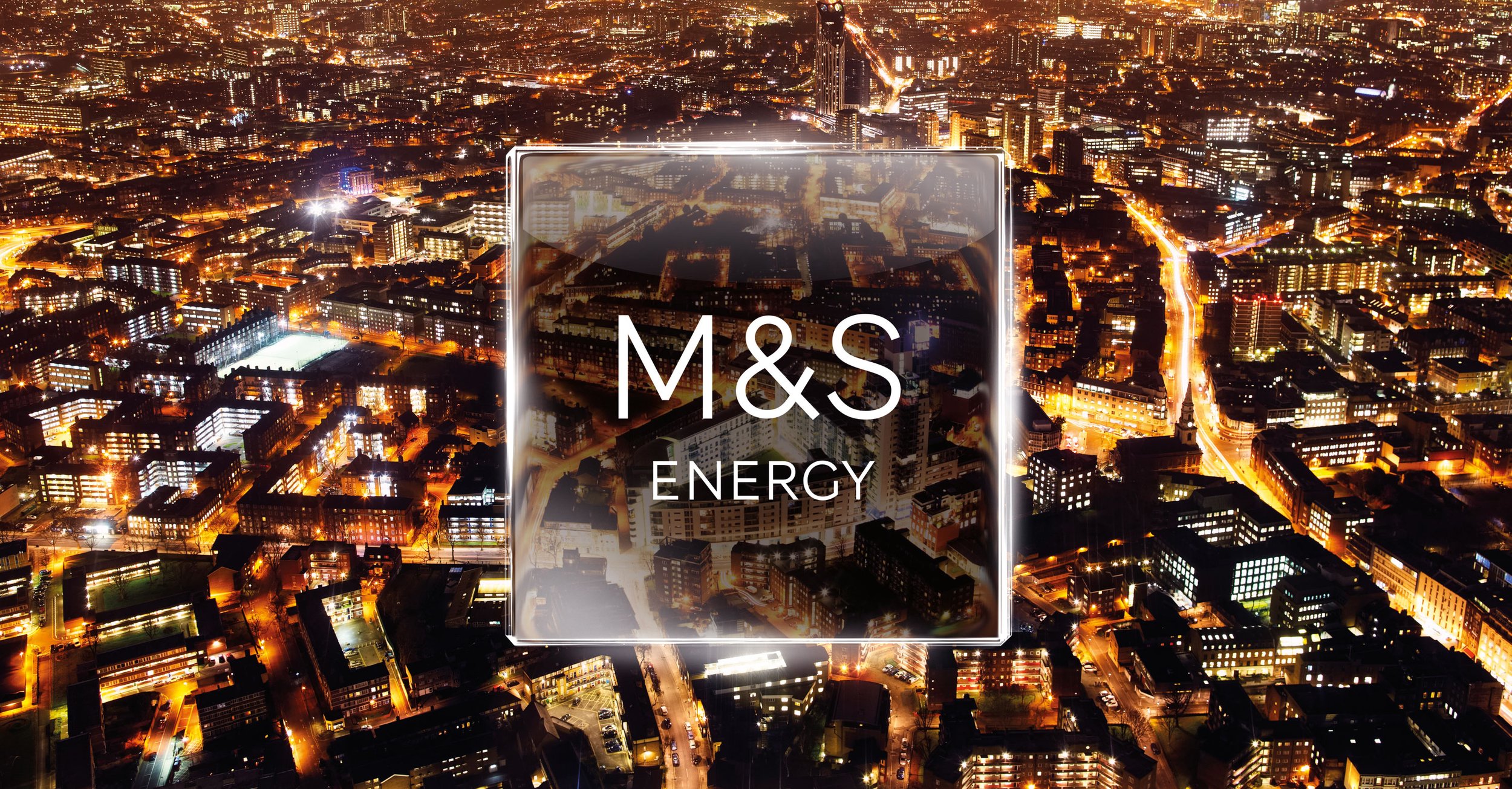
A series of photos helped launch M&S Energy across important customer channels. The collection represented the brand’s values and commitments, highlighting customer trust and sustainable practices.
The images showcased energy use in everyday life, featuring different areas of a typical home. Each photo sought to connect emotionally with customers, stressing reliability and trust, which are vital to the parent retail brand. Additional landscape images illustrated the brand's origin and sustainability.

Developing a comprehensive set of brand guidelines for M&S Energy was essential to ensure consistency in messaging, visual identity, and customer engagement across all platforms.


The brand launched with press ads, Out of Home advertising and a new look website.

