
Marks & Spencer
Brand identity, Brand guidelines
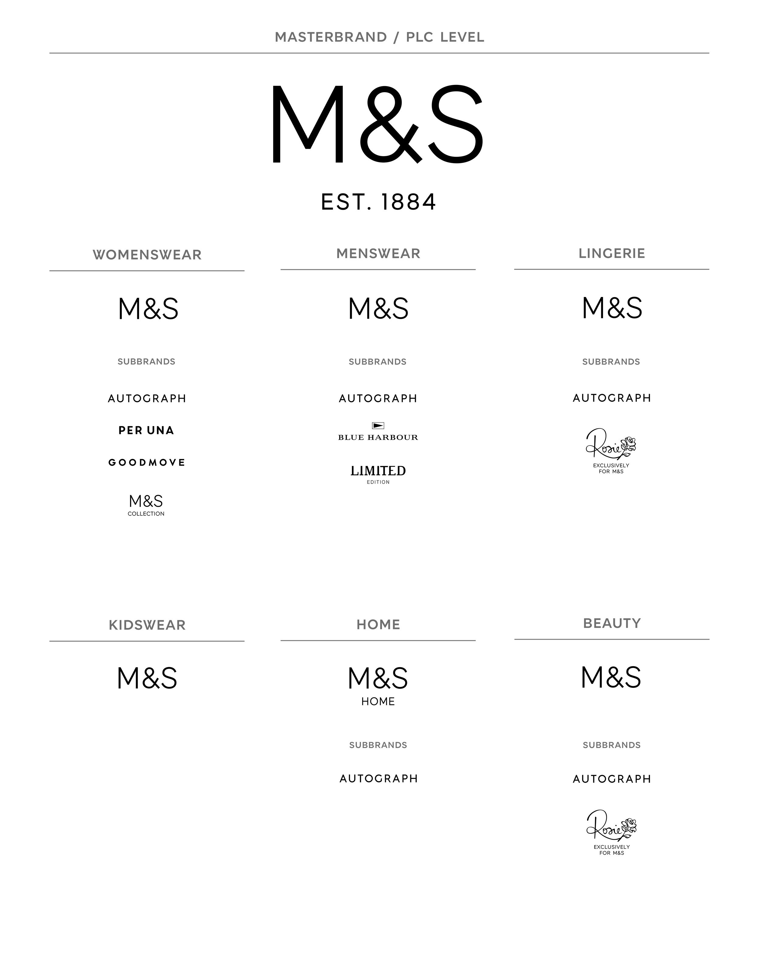
The first step in the transformation of M&S was to re-establish the style credentials of the company. A more modern, contemporary logotype lay at the heart of this.
Marks & Spencer wanted to change perceptions. Many people felt they had an old fashioned brand and the clothes were not desirable enough. The ubiquitous Helvetica had been used for many years as the brand typeface and logotype. Perhaps fine for A. N. Other company, but lacking personality for Britain’s favourite retailer.
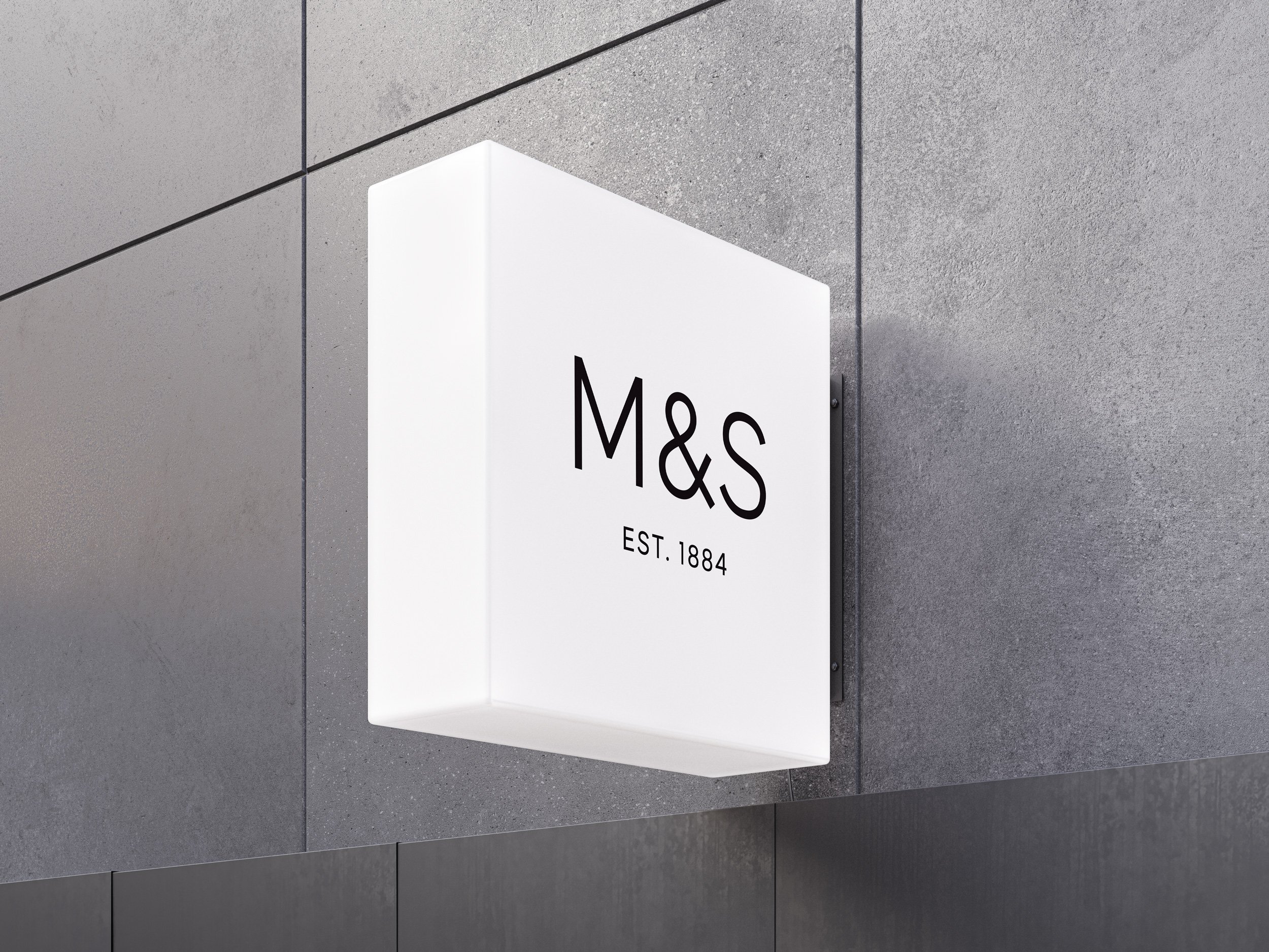
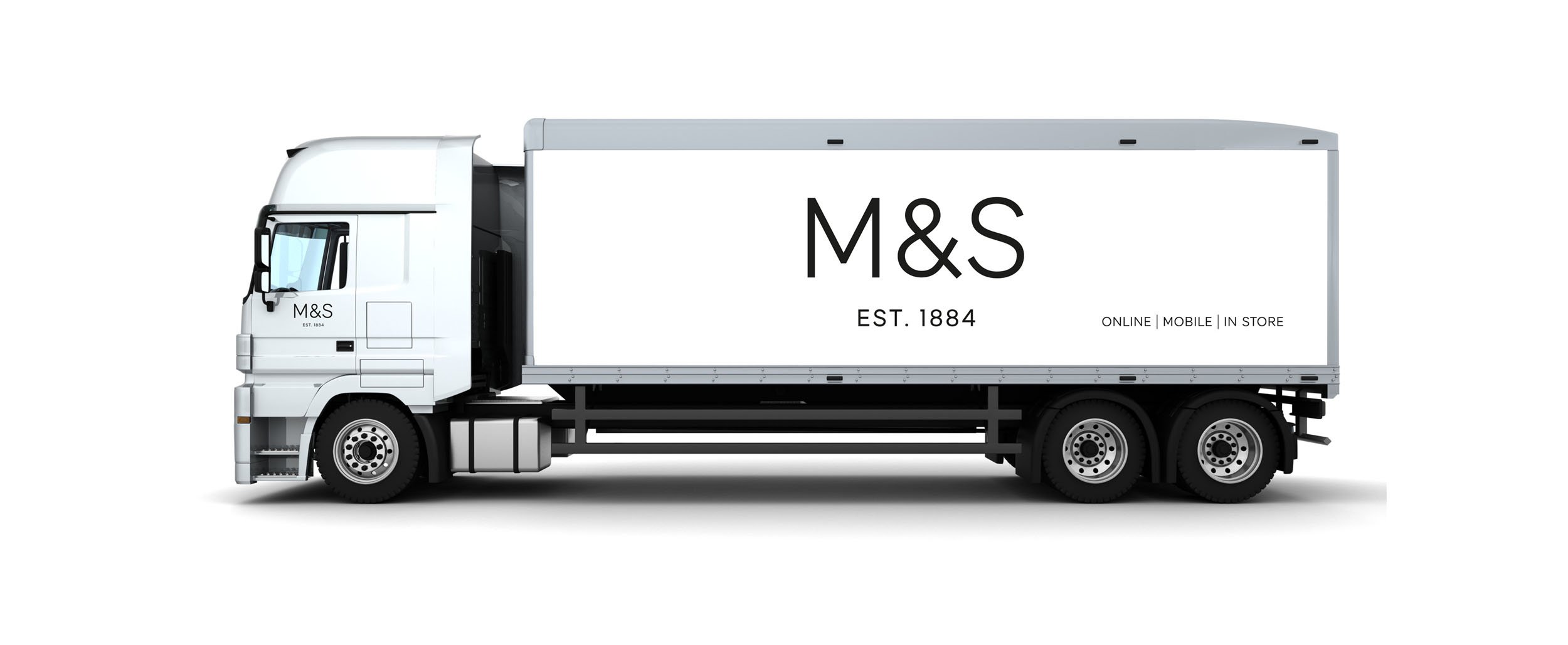
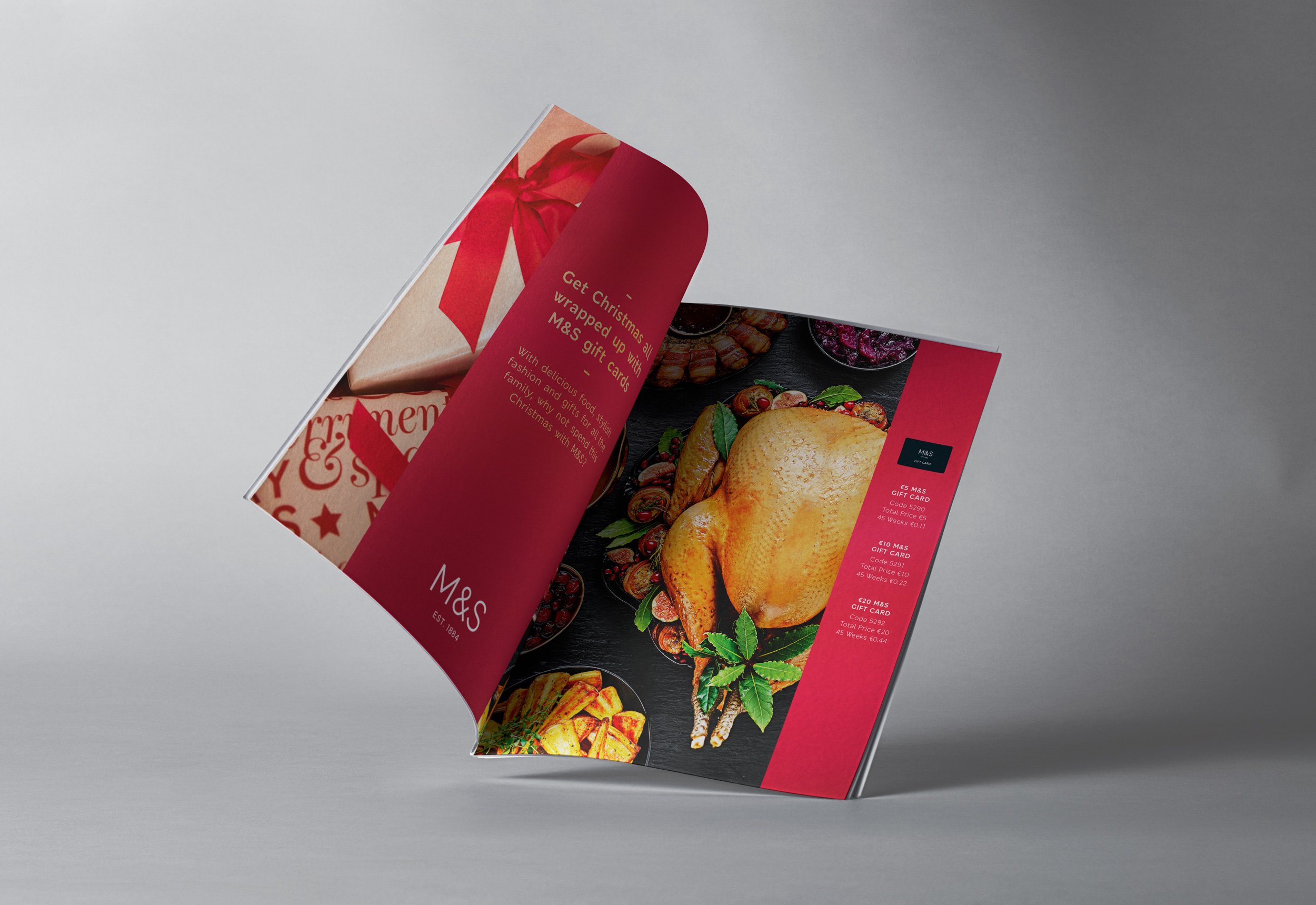
The answer was to develop a new logotype which looked more contemporary, spoke the language of fashion and also gave reference to the fantastic longevity and heritage of the brand. M&S Est 1884 was born. A celebration of over 140 years at the heart of the nation’s, well, heart.
An extensive set of brand guidelines was created for the new logotype for both the UK and international businesses.
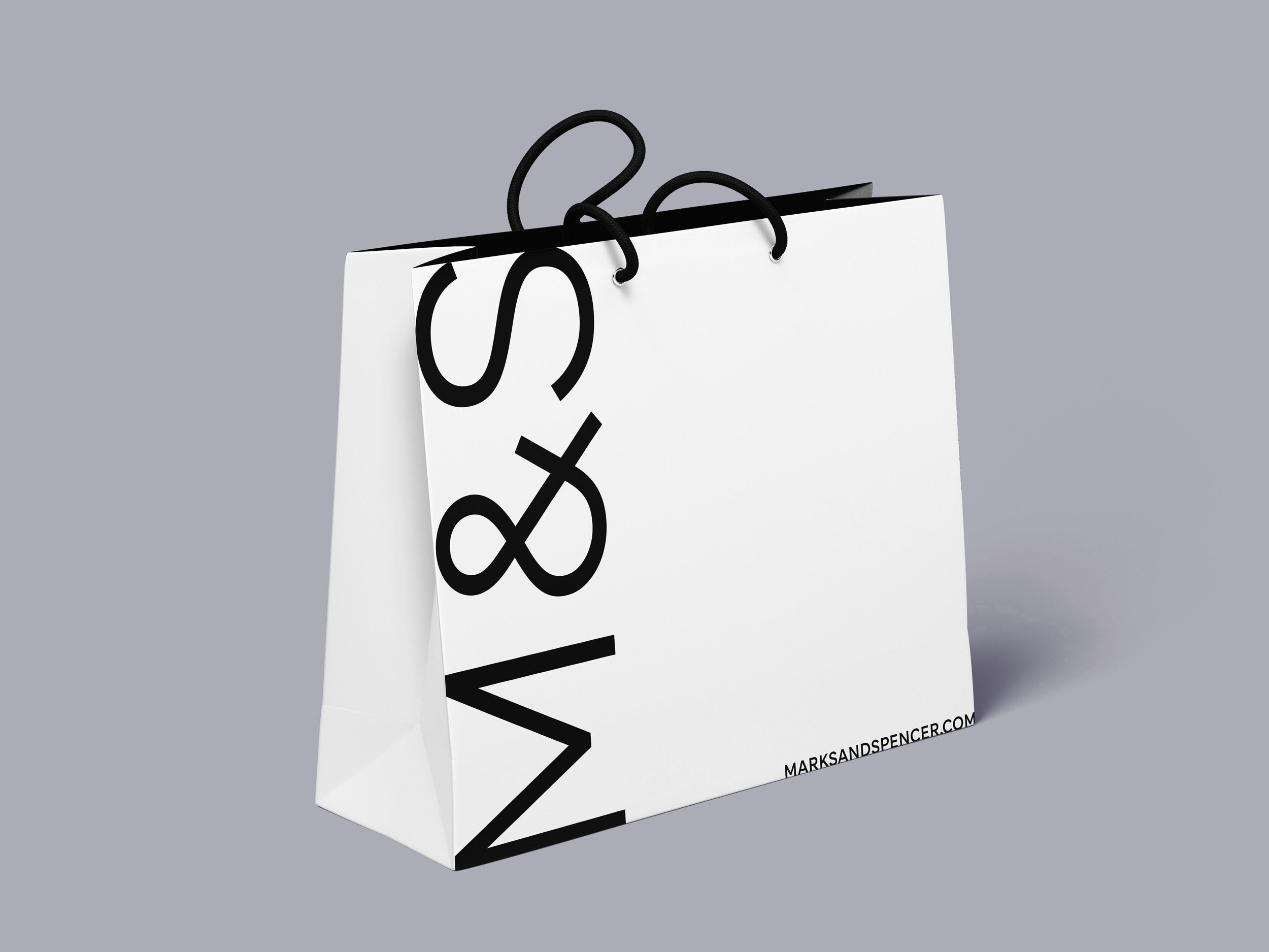
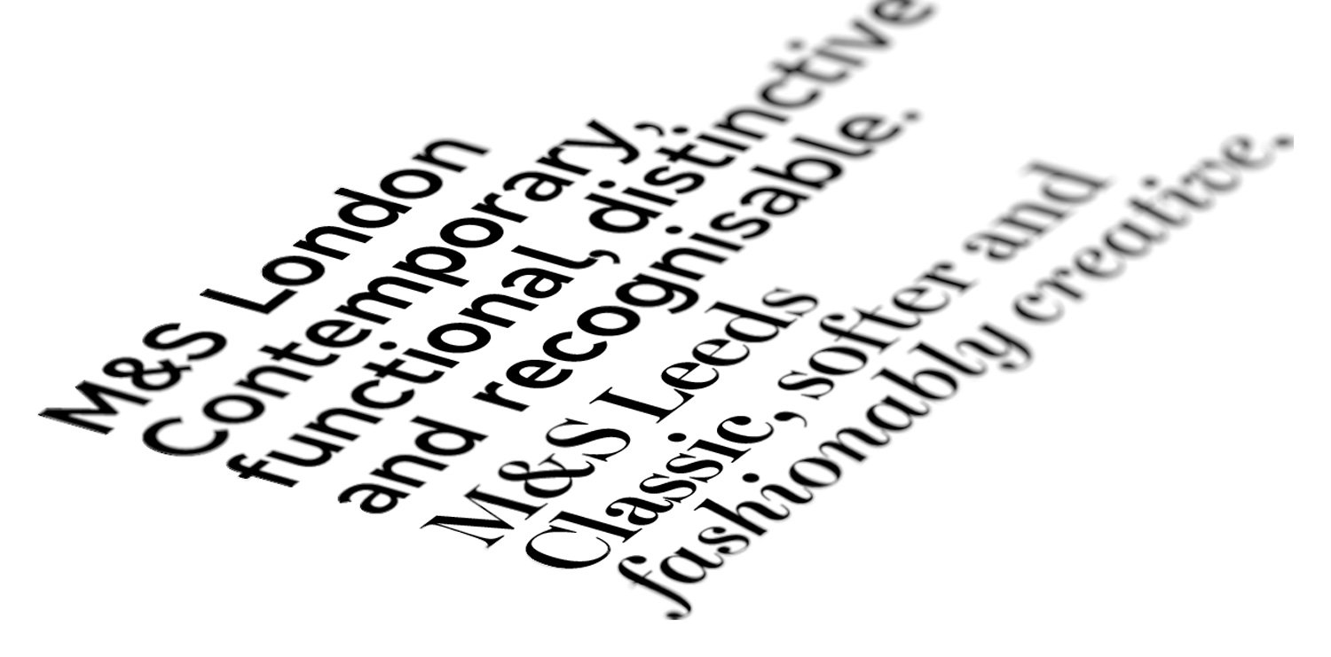
Another aspect of the rebranding of M&S was to develop a new typeface to replace the rather non-descript Helvetica. After extensive research, and working in collaboration with a leading type foundry, two typefaces were developed - M&S Leeds and M&S London.
Leeds was the playful, stylish one used on headings and London sat alongside as the 'heavy-lifter' that would be used for body copy, where legibility at smaller sizes was key.

Digital billboards were used to put the brand at the front of customer’s minds
Marks & Spencer London
M&S has a large portfolio of stores overseas, and research showed the colloquial name M&S, so familiar in the UK, did not have the same resonance in other countries.
This, in theory, posed a problem. Would two different identities work together? The answer was to use the full name in the new M&S London typeface, but also use ‘London’ to link the retailer to its parent city.


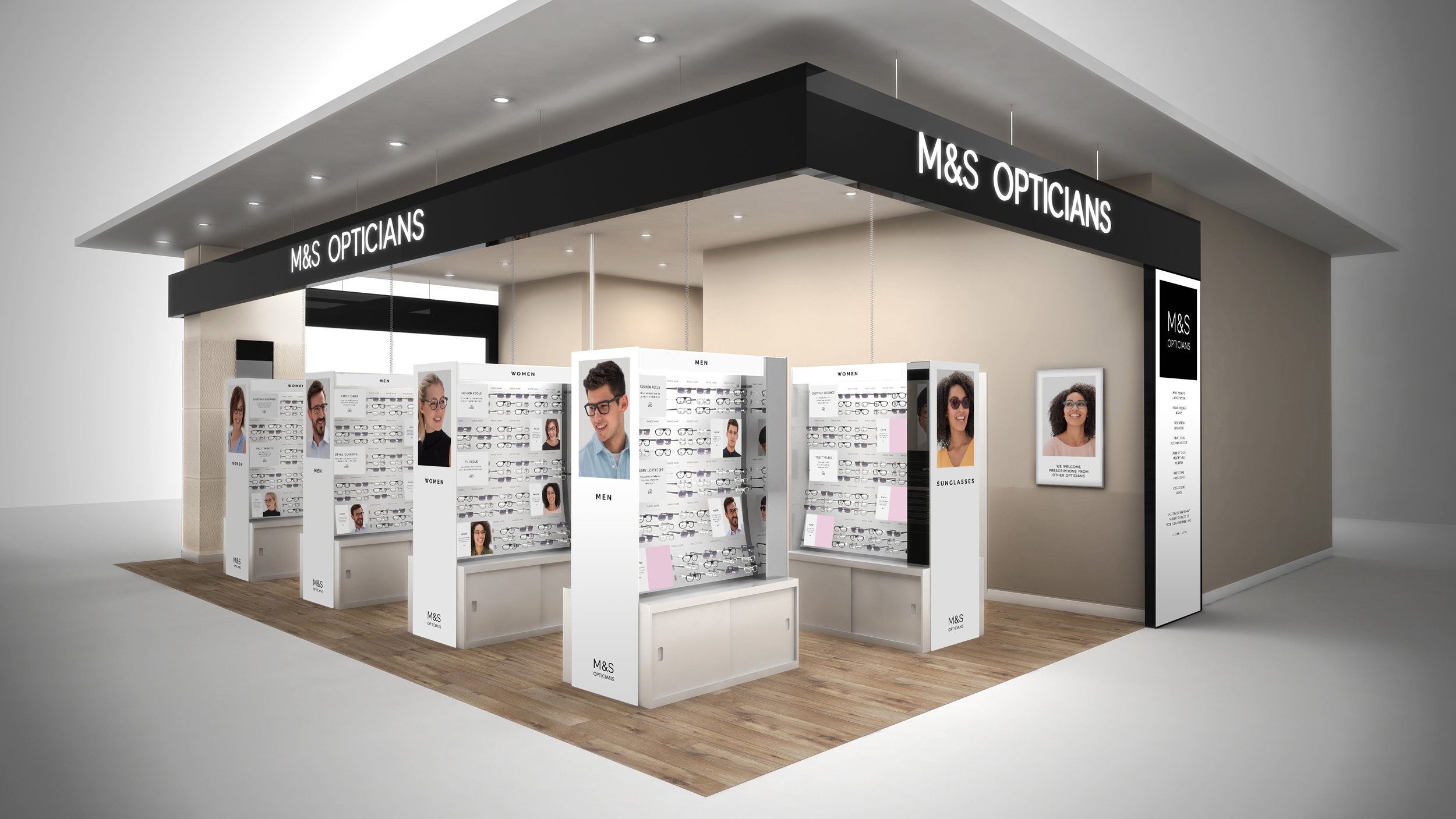
M&S Opticians
The idea to launch an opticians within some larger M&S stores made a lot of sense, building on the well-established trust of the brand. The brief was to design a proposition aligned to the masterbrand but with some distinctive elements.
The opticians areas were brightly lit, friendly and welcoming. This was achieved with engaging photography and a warm, clear tone of voice.


Other projects


